|
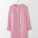
Well, if you ask this question now – Spring/Summer 2017, the answer would surely be pink! But what good is that to you? Have you any idea how many shades of pink are out there? Baker-Miller pink, Mountbatten pink, Puce, Fuchsia, Shocking pink, Fluorescent pink, Amaranth, Salmon pink, to name but a few… Anyway, get my drift…it can be a minefield when it comes to colour. If you want to be on trend – think ‘bright’, it will certainly cheer you up! Top row from Zara, or you maybe more of a Boden girl, second row!
But who can really wear bright pink? For example, if you are wearing too much ‘Barbie pink’ for an interview you could be construed as too ‘girly’ and not taken seriously enough. Whereas a pop of Fushia grounded with mainly navy and possibly another neutral can look very different – getting the balance right will mean you come across warm, approachable and innovative. The things you should know: Wearing the ‘right’ colour, tone and shade that suits your natural complexion can be very uplifting, it can make you stand out in a crowd, look younger than your years and give a sparkle to your eyes. But there are some things you should know to help you get the perfect shade.
So there are lots of aspects to consider – give it a go – check you colours in the mirror (best to be make-up free because then it will be more obvious to you!) – do you notice the colour before seeing you?
If you’ve got an eclectic array of colour in your wardrobe and never really know what works best or if you’re someone who plays it safe with neutrals, I can show you how to safely experiment with colour so that you can feel more confident, getting admiring compliments. What colour were you wearing the last time you received a compliment?
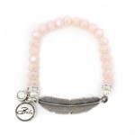
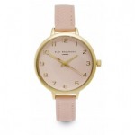
Don’t forget your accessories, including specs! These are from Davies Opticians who also have other colour ways with a hint of pink! www.davisopticians.co.uk For jewellery check out www.piccadillylily.com, these are all under £50! If you see anything you like use the code ‘lesley’ and you’ll get 10% off! Give me a call or check out information about Colour Analysis on my website. |


